Banana books is a curated repository with the best design and illustration books.
We’ve extracted data from many websites like designernews, reddit, etc, and sorted them by popularity using goodreads in order to create this list.
Just good books. Zero bullshit.
 Top 1
Top 1 Top 2
Top 2 Top 3
Top 3 Top 4
Top 4To achieve success in today's ever-changing and unpredictable markets, competitive businesses need to rethink and reframe their strategies across the board. Instead of approaching new product development from the inside out, companies have to begin by looking at the process from the outside in, beginning with the customer experience. It's a new way of thinking-and working-that can transform companies struggling to adapt to today's environment into innovative, agile, and commercially successful organizations.
Companies must develop a new set of organizational competencies: qualitative customer research to better understand customer behaviors and motivations; an open design process to reframe possibilities and translate new ideas into great customer experiences; and agile technological implementation to quickly prototype ideas, getting them from the whiteboard out into the world where people can respond to them.
In Subject to Change: Creating Great Products and Services for an Uncertain World, Adaptive Path, a leading experience strategy and design company, demonstrates how successful businesses can-and should-use customer experiences to inform and shape the product development process, from start to finish.
Emil Ruder's Typography is the timeless textbook from which generations of typographer and graphic designers have learned their fundamentals. Ruder, one of the great twentieth-century typographers was a pioneer who abandoned the conventional rules of his discipline and replaced them with new rules that satisfied the requirements of his new typography. Now in its sixth printing, this book has a hallowed place on the bookshelves of both students and accomplished designers. Dimension: 83/4 x 11 inches, over 500 examples, English, German & French text.
TypographyLife in the image world has made us all voracious, if not always deliberate, consumers of visual messages. Easy access to computer graphic tools has turned many of us into either amateur or professional image producers. But without a basic understanding of visual language, a productive dialogue between producers and consumers of visual communication is impossible. Visual Grammar can help you speak and write about visual objects and their creative potential, and betterunderstand the graphics that bombard you 24/7. It is both a primer on visual language and a visual dictionary of the fundamental aspects of graphic design.Dealing with every imaginable visual conceptfrom abstractions such as dimension, format, and volume; to concrete objects such as form, size, color, and saturation; to activities such as repetition, mirroring, movement, and displacement; to relations such as symmetry, balance, diffusion, direction,and variationthis book is an indispensable reference for beginners and seasoned visual thinkers alike. Whether you simply want to familiarize yourself with visual concepts or whether you're an experienced designer looking for new ways to convey your ideas to a client, Visual Grammar is the clearand concise manual that you've been looking for.
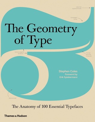
PerceptionStudents and professionals in any creative field can benefit from a good typographic eye. The Anatomy of Type (The Geometry of Type in the UK) is all about looking more closely at letters. Through visual diagrams and practical descriptions, you’ll learn how to distinguish between related typefaces and see how the attributes of letterforms (such as contrast, detail, and proportion) affect the mood, readability, and use of each typeface. Nutritional value aside, the spreads full of big type are nice eye candy, too.
The 100 typefaces featured in the book are hand-picked by the author for their functionality and stylistic relevance in today’s design landscape. Along with several familiar faces (Garamond, Bodoni, Gill Sans, Helvetica), you’ll also discover contemporary fonts that are less common — and often more useful — than the overused classics.
Students and professionals in any creative field can benefit from a good typographic eye. The Geometry of Type (The Anatomy of Type in the US) is all about looking more closely at letters. Through visual diagrams and practical descriptions, you’ll learn how to distinguish between related typefaces and see how the attributes of letterforms (such as contrast, detail, and proportion) affect the mood, readability, and use of each typeface. Nutritional value aside, the spreads full of big type are nice eye candy, too.
The 100 typefaces featured in the book are hand-picked by the author for their functionality and stylistic relevance in today’s design landscape. Along with several familiar faces (Garamond, Bodoni, Gill Sans, Helvetica), you’ll also discover contemporary fonts that are less common — and often more useful — than the overused classics.
Once upon a time, only typesetters needed to know about kerning, leading, ligatures, and hanging punctuation. Today, however, most of us work on computers, with access to hundreds of fonts, and we’d all like our letters, reports and other documents to look as good – and as readable – as possible. But what does all the confusing terminology about ink traps, letter spacing, and visual centring mean, and what are the rules for good typography? Type Matters! is a book of tips for everyday use, for all users of typography, from students and professionals to anyone who does any layout design on a computer. The book is arranged into three chapters: an introduction to the basics of typography; headline and display type; and setting text. Within each chapter there are sections devoted to particular principles or problems, such as selecting the right typeface, leading, and the treatment of numbers. Examples throughout show precisely what makes good typography – and, crucially, what doesn’t. Authoritatively written and designed by a practitioner and teacher of typography, Type Matters! has a beautifully clear layout that reinforces the principles discussed throughout.
TypographyPractical and hands-on in approach, this book/exercise manual speaks clearly to beginning graphic designers and others involved with type about the complex meeting of message, image, and history surrounding typography. Focused on intent and content, not affect or style, it makes informed distinctions between what is appropriate and what is merely show (especially in terms of the "junk" often generated unenlightened by computer users). Filled with examples, exercises, and background information--and designed itself to reflect good typographic design--it guides readers systematically to the point where they can not only understand but demonstrate basic principles of typography, and thereby strengthen their own typographic instincts. Basics. Development. Letters. Words and Phrases. Text. Simple Organization. Grid Systems. For beginning graphic designers and others interested in learning the effective use of type.
TypographyAt last! Here is true practical help for budding freelance illustrators. This book helps you avoid the pitfalls that can ruin a career, with advice on crucial first impressions, how to create a portfolio and approach clients, how to negotiate contracts, and how to handle, deliver, and bill the first job. It discusses how to set up a studio, maintain a steady flow of work, and manage time and money. In addition, it provides information on successful self-promotion, self-publishing, and the prosand cons of agents.
Packed with useful tips gleaned from the author's own career and his work as an agent handling major artists in the US and UK, the book includes interviews with nine big-name illustrators. The reader benefits from their experience of starting out; what they learned during the metamorphosis from student to professional; what their expectations and experiences have been. In addition, art directors and commissioners describe the ways they like to be approachedand the ways they really dislike.
This collection of 23 essays on book design and typography should be read at least once by all typographers and students of design. Written over a period spanning 42 years, these essays cover many aspects of typography from paper color to tight typesetting to page proportions. A few of the ideas presented in the essays may indeed be outdated now (due mainly to the economic freedoms in modern digital design), but they are few and are still important from an historical persective. Folloowing the rules of design presented here will help ensure a well designed book that does not detract from the contents in any way and best serves to allow that content to speak for itself. Even if you want to always break the rules of design, isn't it better to understand why and how those rules came to be? Of interesting note is that Jan himself was in his youth a radical rulebreaker in his designs, but he learned when it was best to work inside and outside the rules to present the best effect, his design legacy shows how effective he was, and how influencial he remains to this day.
GridsAdhering to certain layout and grids standards and principles is important for any job from brochures, to annual reports, to posters, to websites, to publications. However, knowing how to bend the rules and make certain grids work for the job at hand takes skill.
This book will outline and demonstrate basic layout/grid guidelines and rules through 100 entries including choosing the a typeface for the project, striving for rhythm and balance with type, combining typefaces, using special characters and kerning and legibility. These essentials of grid design are critical to the success of any job.